GRAPHIC DESIGN
Beer Cats Logo
Tokyo, Japan
Project: refresh the existing logo and build out a more comprehensive logo suite using existing company colors
My role: collaborate directly with the founder/owner to refine details and recapture the nuances of the founder’s original sketch
Website: beercats.jp
Design Process
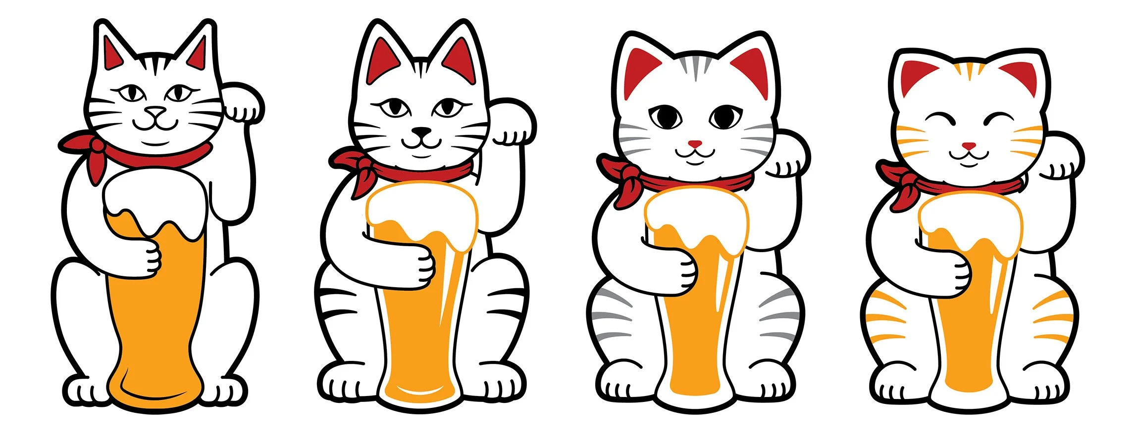
Inspiration struck early and I made my first sketches after some unofficial discussion but before a focused conversation. I also experimented with different types of eyes to showcase different personalities. (This is by no means a standard practice, but when inspiration strikes I have to get out the sketchbook!)
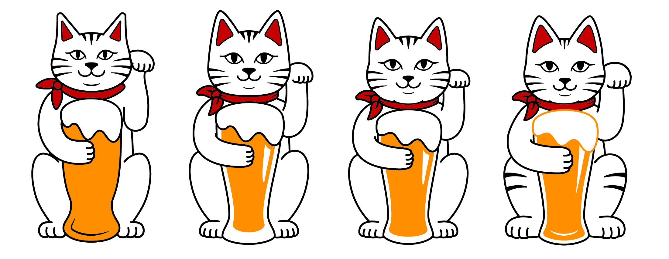
For the first official draft, Beer Cats provided the original sketch that the existing logo was based on. From this, I made a spectrum from as faithful to the original as possible to a complete re-imagining.
I also tested different sans serif fonts to see what would balance well with the weight and proportions of the cat.
The client wanted to stay fairly true to the original, so he wanted to see something between #1 and #2 on the first spectrum. This led to a new spectrum with more subtle differences between each version.
With the chosen font, this draft had different ways to arrange the cat and the text as well as a few variations on a text-focused version.
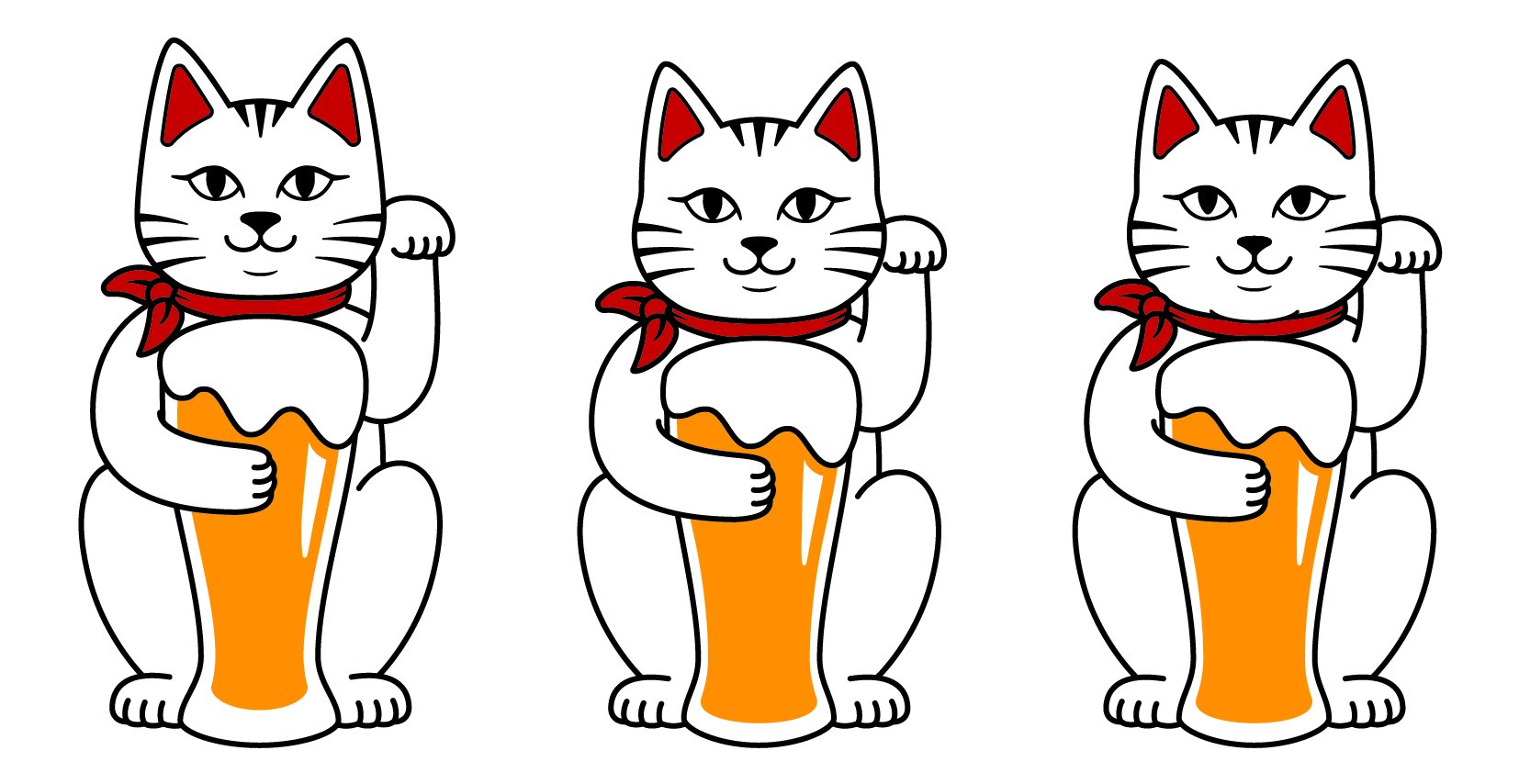
For the following cat draft, the client again requested a cat between #1 and #2, and the final details were hammered out over a video call.
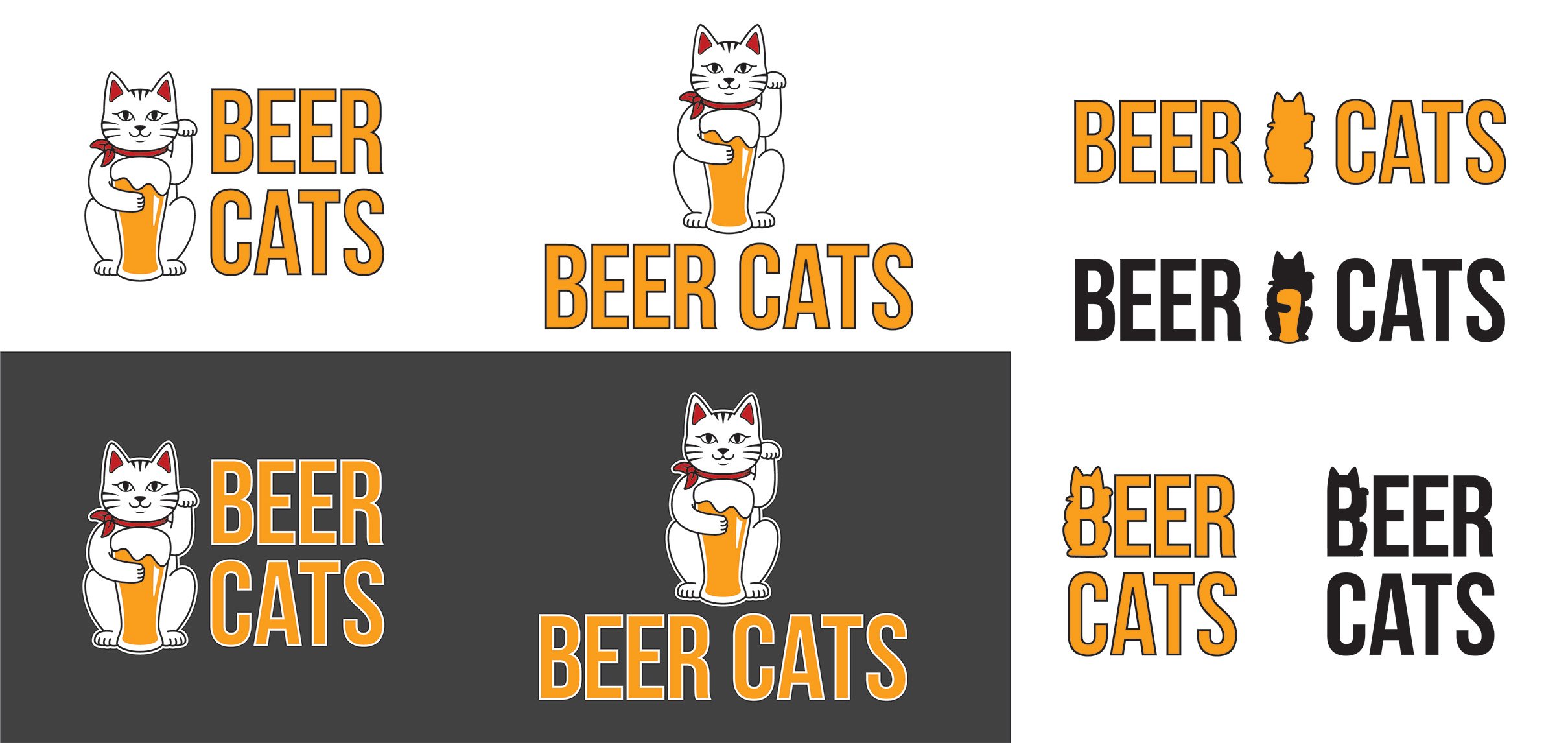
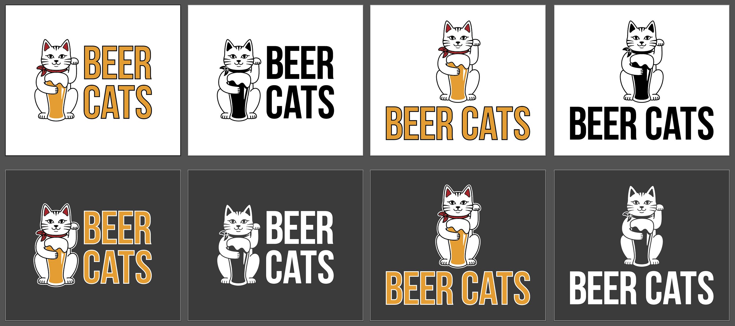
With the final cat and the selected font, I created a suite of logos for different use cases. Horizontal, vertical, 4-color, 1-color, each for both light and dark backgrounds, and the full-color beer and cat head as independent graphics. The client decided against including a text-only variation.
When I sent the final files, I also included a brand guideline document with color breakdowns and typefaces.


